Duolingo Branding and Brand Guidelines

The free, gamified language-learning app fronted by a chaotic green owl

Duolingo Overview

Duolingo grew out of an idea Luis von Ahn began developing around 2009, after selling his previous company, reCAPTCHA, to Google. Von Ahn, a Guatemalan-American computer scientist and Carnegie Mellon professor who had co-invented CAPTCHA, wanted to put free education within reach of people who could never otherwise afford it. He built Duolingo with Severin Hacker, a Swiss PhD student at Carnegie Mellon, and the company was formally incorporated on 18 August 2011. After a closed beta that began in November 2011 and drew around 300,000 registered users, the Duolingo app launched to the general public on 19 June 2012. Language learning was reframed from classroom instruction into bite-sized, gamified daily practice, with points, levels and streaks standing in for grades and homework.

Learn More Show Less

Growth was rapid and largely organic: Duolingo passed 3 million users by mid-2013 and 100 million by 2015, and the company introduced a freemium subscription model in 2017 alongside advertising. Duolingo went public on the NASDAQ under the ticker DUOL on 28 July 2021, pricing its IPO at $102 a share. By the third quarter of 2025, Duolingo passed 50 million daily active users for the first time, and full-year 2025 revenue guidance sat in the region of $970-990 million, up roughly 40% year on year, with the company continuing to describe itself as still early in its growth journey. Duolingo remains headquartered in Pittsburgh, Pennsylvania, where Carnegie Mellon is based.

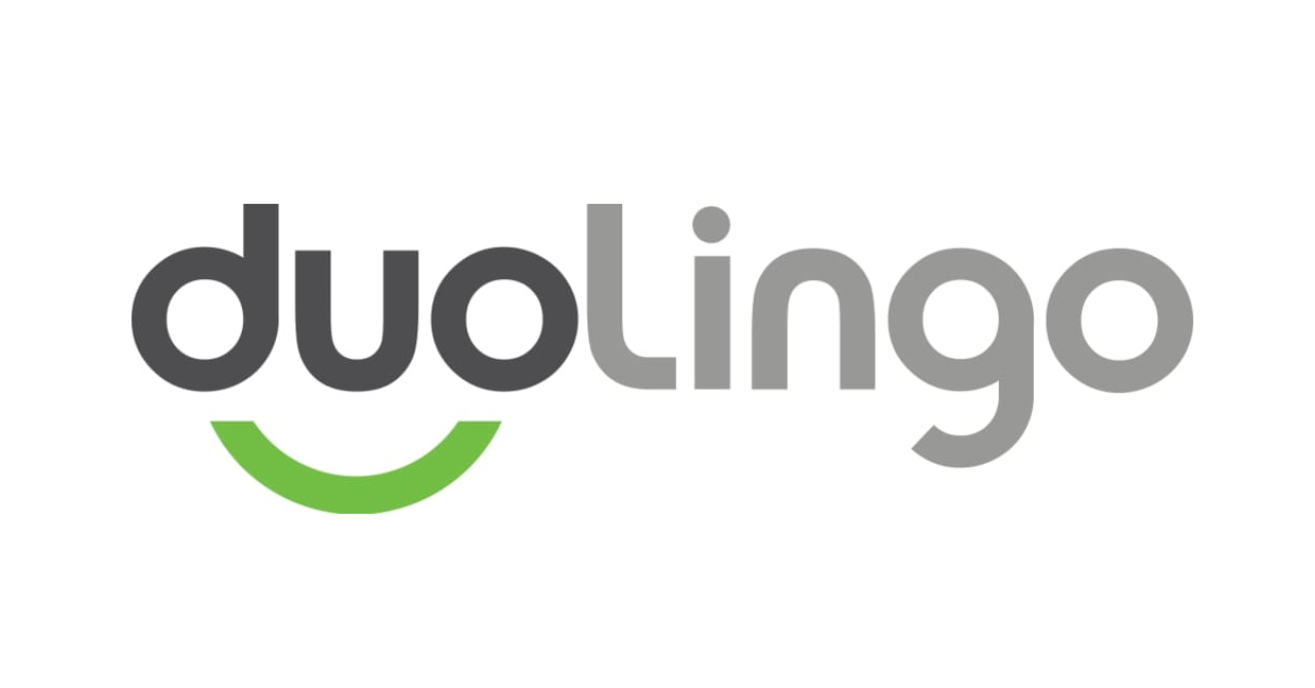
Visually, the Duolingo identity has always centred on the same two ingredients: an owl mascot and a distinctive green, though both have been redrawn repeatedly. The 2010 beta wordmark split ‘duo’ (dark grey) from ‘lingo’ (light grey), with a green arc beneath ‘duo’ forming a smile and suggesting eyes and a beak. The 2011 public-launch redesign simplified this into a single, unified vibrant green wordmark with the smile-arc removed. That version held for eight years until 2019, when Duolingo introduced its current wordmark, set in a bespoke typeface called Feather Bold whose angled, rounded letterforms echo the shapes of the owl mascot itself, down to a ‘g’ with a flick designed to mimic Duo’s eyebrows.

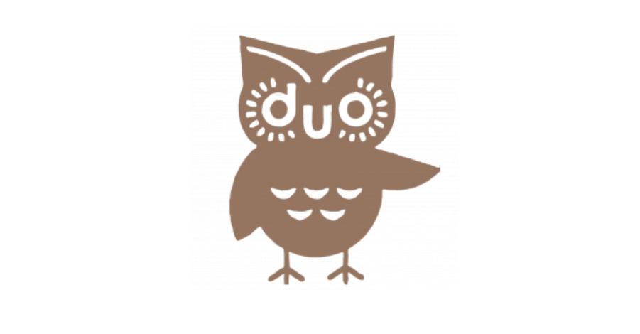
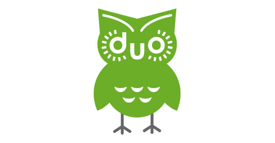
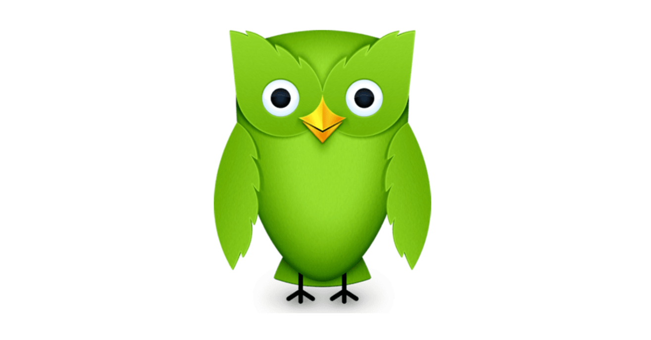
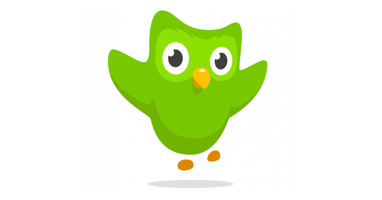
Duo the owl has gone through an even more dramatic evolution than the logo. The 2010 beta version was a detailed brown owl with a raised wing in a welcoming gesture, clawed feet and the word ‘duo’ forming its eyes and beak. The 2011 public-launch version turned the owl green and dropped the raised wing for a more symmetrical look, while a 2012 redesign removed the ‘duo’ lettering from the face entirely in favour of a more naturalistic owl with plumage and a green gradient. A 2013 update flattened and animated the design, showing Duo mid-jump for a friendlier, more dynamic mascot usable across more touchpoints. The version introduced in 2019, credited to design lead Jack Morgan, is the Duo still in use today: simplified further, with small details like eye feathering, and built specifically to be shown across a wide range of emotional states, from bewilderment to joy, so the character could carry personality across the app and, increasingly, social media.

That flexibility paid off directly. In September 2021, then-23-year-old social media coordinator Zaria Parvez revived Duolingo’s dormant TikTok account, at one point filming content herself inside the office’s own owl costume; the account grew from around 50,000 followers to more than 16 million by the time Parvez left the company in August 2025, outpacing far larger consumer brands. The strategy leaned on treating Duo like an internet creator rather than a sanitised brand rep, responding to trends and comments in near real time, including a running, self-aware bit about Duo’s unrequited obsession with singer Dua Lipa, complete with a mock proposal outside her Madison Square Garden concert. That storyline paid off spectacularly in February 2025, when Duolingo announced on social media that Duo had died, reportedly hit by a Tesla Cybertruck, prompting Dua Lipa herself to post ‘Til’ death duo part’ in tribute. Duolingo sustained the bit for two weeks, including a video eulogy from CEO Luis von Ahn, before revealing on 25 February that Duo’s death had been staged, a publicity stunt Duo ‘confessed’ to on camera, climbing out of his own coffin.

Duolingo’s colour system is built directly from the mascot: Feather Green (#58CC02) is the brand’s defining hue, described in its own public guidelines as the one ‘the world associates with Duolingo’, paired with the brighter Mask Green (#89E219) as a background for Duo, the dark neutral Eel (#4B4B4B) for typography, and white (‘Snow’) as the primary background. A bold secondary palette, Macaw blue, Cardinal red, Bee yellow, Fox orange, Beetle purple and Humpback blue, adds variety to illustrations and full-bleed backgrounds without diluting the core green identity.

Typography follows a similarly clear division of labour: the bespoke Feather Bold, set only in lowercase and used for headlines and impact moments, and DIN Next Rounded, a clean rounded sans-serif used in standard sentence case for subheadings and body copy, deliberately never mixed with Feather Bold in the same sentence. Duolingo’s tone of voice, described internally as expressive, playful, embracing and worldly, keeps language simple and globally understandable, avoids slang or references that might exclude non-native or international audiences, and treats celebrating small wins as core to the product experience rather than an afterthought.

Duolingo’s brand guidelines are unusually open for a public company, hosted at design.duolingo.com and covering everything from logo lockups and clear space to mascot expression rules, motion and illustration style, in the same friendly, direct tone as the product itself. The website and app carry that consistency through: big Feather Bold type, character-led illustration, short conversational copy, and Duo present throughout, turning what could be friction points, mistakes, reminders, delays, into moments of humour rather than intimidation.

The clearest lesson in Duolingo’s brand history is that a mascot built for flexibility from the start can become the brand’s single biggest growth lever. Duo wasn’t simply redesigned to look better over time; each version was made easier to animate, emote and deploy across new channels, culminating in a mascot expressive enough to run a genuinely daring, sustained fake-death storyline on social media without damaging (and arguably reinforcing) the brand’s core promise that learning, and the brand itself, should never feel like a chore.

What Duolingo Does Well

  • A mascot deliberately redesigned for emotional range, not just visual appeal, gave Duolingo a character flexible enough to run a genuinely daring fake-death campaign without damaging trust.
  • Publishing brand guidelines openly at design.duolingo.com invites consistency across an enormous surface area (app, web, social, partners) while reinforcing the brand's own value of open access.
  • An unapologetically bold green, paired with a genuinely custom typeface tied to the mascot's shapes, makes the brand instantly identifiable even from a single UI element or social post.

What We Can Learn from Duolingo

  • A mascot's redesigns should be judged by how much emotional range and flexibility they add, not just how modern they look, since that range is what eventually made viral marketing possible.
  • Letting a junior team member experiment on a low-stakes channel (a dormant TikTok account) can produce outsized brand value that no top-down campaign brief would have proposed.
  • A brand built on encouragement can still take real creative risks, like killing off its own mascot, provided the humour is aimed at the brand's own character rather than at the audience.

Background

Colour hex codes are confirmed directly on Duolingo's own public guidelines site (design.duolingo.com), with no discrepancies found elsewhere. Sources vary on the idea's origin (around 2009) versus formal incorporation (18 August 2011); this profile uses 2011 per Duolingo's own SEC filings.

Colour Palette

Current Mascot

Duo (current) mascot
Duo (current)

2019 · 2019-Present

Led by design lead Jack Morgan, this version simplified Duo's shape further, adding small details like eye feathering, and was built specifically to carry a wide range of emotional states, from bewilderment to joy, enabling his later viral social media success.

Word Cloud

Duo the owl Streak Feather Green Unhinged Gamified When in doubt, lean in to green Expressive Playful Embracing Worldly Feather Bold Duolingo Max Duolingo English Test Trailblazer Free education for everyone Til' death duo part Bite-sized lessons Comment section is our social brief Ohana Daily Active Users

Notable Rebrands

Current

2019-Present

2019

Duolingo's most significant identity update: a new bespoke typeface, Feather Bold, brought the wordmark's letterforms into direct visual alignment with the redesigned Duo mascot for the first time, unifying the brand's two most recognisable assets.

Colour Palette

Feather Green

Primary

HEX: #58CC02

RGB: 88, 204, 2

CMYK: 58, 0, 96, 0

The brand's defining colour, taken directly from Duo the owl; Duolingo's own guidance says simply 'when in doubt, lean in to green'.

Mask Green

Accent

HEX: #89E219

RGB: 137, 226, 25

CMYK: 42, 0, 87, 0

A brighter secondary green used as a background for Duo or for contrast next to Feather Green.

Eel

Dark

HEX: #4B4B4B

RGB: 75, 75, 75

CMYK: 3, 0, 21, 88

A dark grey used primarily for typography, offering contrast without the starkness of true black.

Snow

Light

HEX: #FFFFFF

RGB: 255, 255, 255

CMYK: 0, 0, 0, 0

Duolingo's primary background colour across the app and website.

Tone Profile

Funny
Serious
Formal
Casual
Respectful
Irreverent
Enthusiastic
Matter-of-fact

Tone Shape

Tone Pillars

Expressive

Communicates genuine excitement about helping people learn, and shares that enthusiasm openly.

Playful

Friendly, creative and clever in a way that runs through the whole brand identity, not just marketing.

Embracing

Celebrates every user success, encouraging and supporting learners rather than judging them.

Worldly

Speaks to a genuinely global audience, avoiding slang or references that might not translate across cultures.

Context Responses

A learner completes a lesson or hits a streak milestone Celebratory and encouraging, treating small wins as genuinely worth marking.
A user misses a lesson or streak Playfully guilt-tripping through Duo's persona, never harsh, but persistent and a little theatrical.
Social media and viral marketing moments Fully unhinged and in-the-moment, treating Duo like an internet creator who reacts to trends in real time.
Global or cross-market communication Deliberately avoids slang, memes or references that would not translate or land outside their origin market.

The tone scales from warm, encouraging product copy to genuinely unpredictable social media content, but never mocks the learner, only ever Duo himself.

Feather Bold specimen

Feather Bold

Display · Custom

Headlines and impact moments, set lowercase only, with letterforms echoing Duo's shape

DIN Next Rounded

Body

Subheadings and body copy, chosen for clean, easy reading across digital screens

Typography Background

Feather Bold is bespoke to Duolingo and unavailable to anyone else, with letterforms directly inspired by the curves and shapes of Duo the owl, down to a ‘g’ with a flick designed to mimic his eyebrows; it was introduced alongside the 2019 logo redesign to bring the wordmark and mascot into visual alignment for the first time. DIN Next Rounded, a licensed rounded sans-serif, was chosen as a contrasting partner: clean and highly legible where Feather Bold is expressive and characterful, letting Duolingo’s headlines carry personality while its longer-form content stays easy to read on small screens.

Mascot

Duo (beta version)

2010–2011 · 2010

The first Duo: a detailed brown owl with clawed feet, feather detailing and a raised wing in a welcoming gesture, with the word 'duo' forming its eyes and beak, introduced to make language learning feel approachable and less intimidating.

Duo (public launch version)

2011–2012 · 2011-2012

Released alongside Duolingo's public launch, this version kept the beta design largely intact but turned Duo green for the first time and removed the raised wing for a more symmetrical, straightforward look.

Duo (naturalistic version)

2012–2013 · 2012-2013

A drastic change: the 'duo' lettering that formed the eyes and beak was removed for a more naturalistic owl, complete with plumage and feathered wings, rendered in a green gradient running from bright at the centre to darker at the edges.

Duo (flattened, animated version)

2013–2019 · 2013-2019

A simplified, flattened, animated style depicted Duo jumping, producing a friendlier and more dynamic mascot that was easier to deploy consistently across different brand touchpoints.

Current

Duo (current)

2019 · 2019-Present

Led by design lead Jack Morgan, this version simplified Duo's shape further, adding small details like eye feathering, and was built specifically to carry a wide range of emotional states, from bewilderment to joy, enabling his later viral social media success.

Duolingo Campaigns

The TikTok Relaunch

2021

Social media coordinator Zaria Parvez revived Duolingo's dormant TikTok in September 2021, filming low-budget content in the office's owl costume and treating Duo like an internet creator rather than a brand mouthpiece. The account grew from roughly 50,000 to over 16 million followers by 2025.

Learn More →

The Death of Duo

2025–2025

Duolingo announced on social media that Duo had died, reportedly hit by a Tesla Cybertruck, sustaining the storyline for two weeks including a CEO-recorded eulogy and tributes from Dua Lipa, before revealing on 25 February that the death had been staged as a publicity stunt for engagement.

Learn More →

Website Signals

  • Bold Feather Bold headline type used throughout key messaging
  • Duo and other characters present across illustration and UI
  • Short, conversational, non-academic copy
  • Dense, text-heavy educational or classroom-style content
  • Simple, repetitive navigation focused on core actions
  • Muted, corporate colour palette
  • Progress and streaks surfaced prominently to build habit

Strengths

Character-led friction removal

Duo turns reminders, mistakes and delays into moments of humour rather than frustration, softening points where users might otherwise disengage or churn.

Consistent habit-building layout

Simple, repetitive navigation keeps core actions in the same place across sessions, helping the daily-practice habit form quickly.

A crusty owl suit and an iPhone

When 23-year-old Zaria Parvez pitched reviving Duolingo's TikTok, she told her boss she needed no budget: 'I have a crusty owl suit and an iPhone.' That low-cost pitch grew into a channel with over 16 million followers.

View resource
Duo's decade-long crush

Duolingo built years of ongoing 'lore' around Duo's unrequited obsession with singer Dua Lipa, including a mock proposal outside her Madison Square Garden concert, a storyline the brand itself has called Duo's central romantic arc.

View resource
CAPTCHA before Duolingo

Co-founder Luis von Ahn had already had two exits, CAPTCHA and reCAPTCHA (sold to Google, 2009), before starting Duolingo; reCAPTCHA's insight, that human effort could be productive, directly shaped Duolingo's crowdsourced-translation origins.

View resource

Want the full picture?

We're building deep-dive sector reports. Be first to know when yours drops.