Microsoft Branding and Brand Guidelines

The productivity and cloud platform empowering every person and organization

Microsoft Overview

Microsoft was founded on 4 April 1975 by childhood friends Bill Gates and Paul Allen in Albuquerque, New Mexico, home to MITS, the maker of the Altair 8800 microcomputer. After Allen spotted the Altair on the cover of Popular Electronics, the pair spent eight weeks writing a BASIC interpreter for the machine, sight unseen, and licensed it to MITS as their first product; Gates left Harvard and Allen quit his programming job in Boston to build the partnership, originally named ‘Micro-Soft’ for microcomputer software, into a company. The trade name was registered with New Mexico in November 1976, and the hyphen was dropped the following year. Microsoft relocated to Bellevue, Washington in 1979 and incorporated there in 1981.

Learn More Show Less

The company’s defining early break came in 1980, when IBM contracted Microsoft to supply an operating system for its first personal computer; the resulting MS-DOS, alongside 1985’s Windows graphical interface, put Microsoft software on the vast majority of the world’s PCs. Microsoft’s 1986 initial public offering made Gates the world’s youngest self-made billionaire the following year at age 31. Through the 1990s and 2000s, Microsoft expanded from PC software into gaming (Xbox, 2001) and cloud computing (Azure, 2010), and in February 2014 Satya Nadella became the company’s third CEO, later articulating a new mission, ‘to empower every person and every organization on the planet to achieve more’, that reoriented the company’s public identity around empowerment rather than the older, narrower goal of ‘a computer on every desk and in every home’. By fiscal year 2025 (ended 30 June), Microsoft reported $281.7 billion in revenue and employed approximately 228,000 people worldwide.

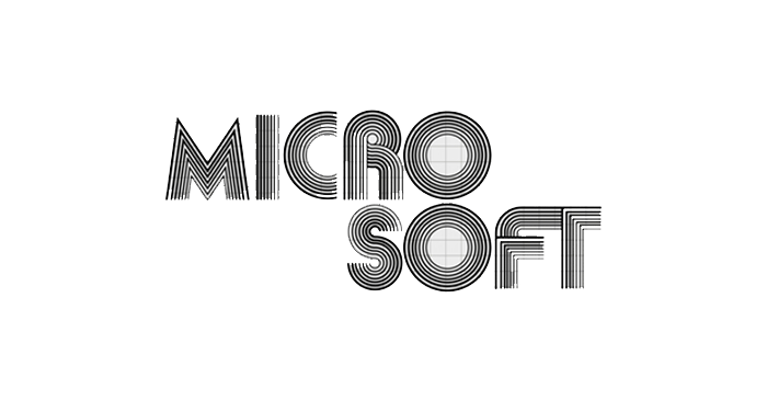
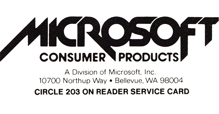
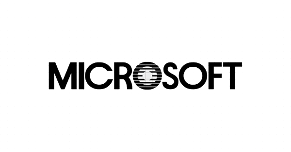
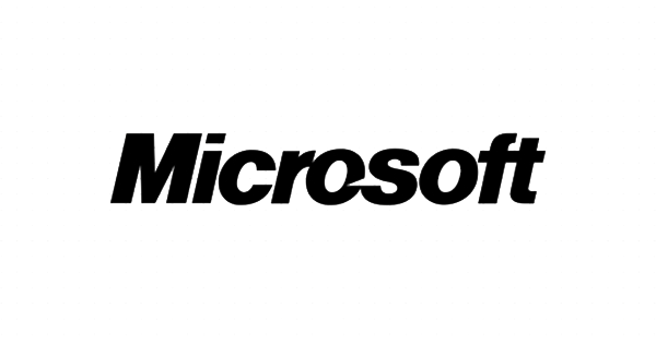
Microsoft’s logo has changed five times since 1975, tracking both the aesthetics of computing and the company’s own evolving personality. The first logo (1975-1980) used disco-era, faintly psychedelic lettering suited to the experimental early computing scene. A 1980 update introduced a custom typeface called New Zelek with a polished, metallic, hardware-influenced look, and fused ‘micro’ and ‘soft’ onto a single line for the first time, a structural choice that has held ever since. In 1982, a geometric mark set in ITC Avant Garde introduced ‘the Blibbet’, a striped letter ‘O’ nicknamed for its resemblance to the grooves on a compact disc, which became a cult favourite among employees despite lasting only five years. The 1987 redesign, created by designer Scott Baker, introduced the bold, italicised, slashed-O wordmark that became one of the most recognisable marks in computing and stayed in place for 25 years.

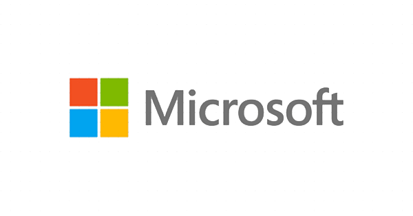
In August 2012, Microsoft unveiled its fifth and current logo, its first change in a quarter century, timed to coincide with the launches of Windows 8, Windows Phone 8, Xbox services and a new wave of Office products. The redesign was led in-house by Microsoft’s own brand strategy team; general manager Jeff Hansen (also referred to as Jeffrey Meisner in contemporary coverage) explained that the company wanted ‘a common look and feel’ across an entire generation of products spanning PCs, phones, tablets and TVs. The new mark dropped the italics entirely in favour of a four-square coloured symbol, red, green, blue and yellow, echoing the Windows tile interface and, according to Microsoft, expressing the diversity of its product portfolio, paired with the company name set in Segoe, the humanist sans-serif already used across its products. Subtly, the redesign also nodded back to the very first 1975 logo by connecting the ‘F’ and ‘T’ of the wordmark.

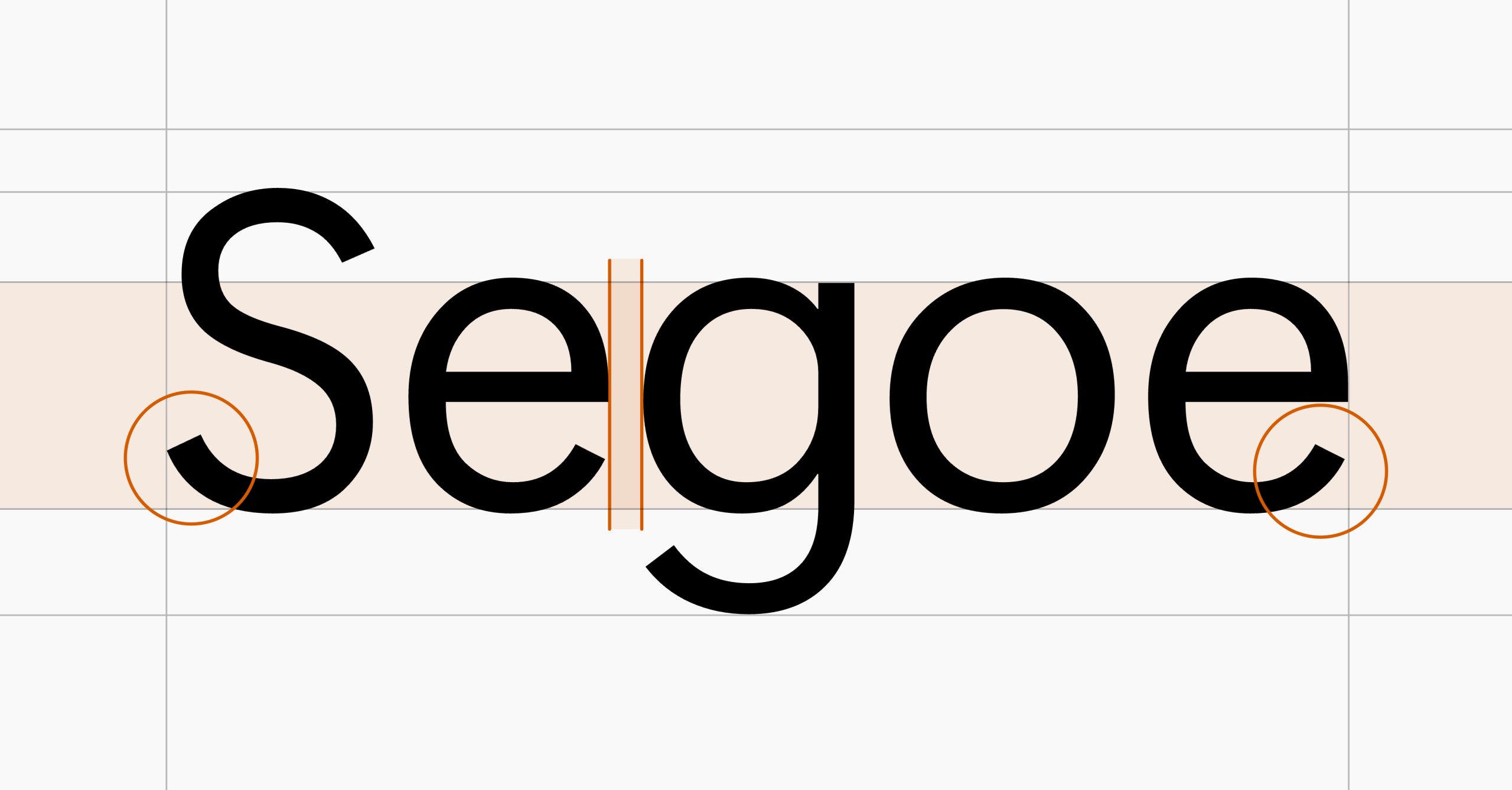
Microsoft’s colour system is built around the four hues in that symbol, blue (#00A4EF), green (#7FBA00), yellow (#FFB900) and red (#F25022), plus a supporting palette of greys and white used to keep interfaces calm and legible. Typography centres on Segoe UI, Microsoft’s primary humanist sans-serif since Windows Vista, chosen for its open apertures, rounded letterforms and legibility at small sizes across an enormous range of devices; secondary typefaces including Segoe Print/Script, Neue Haas Grotesk and DIN appear more sparingly in specific campaigns or sub-brands.

Tone of voice, as Microsoft’s own guidance frames it, rests on three principles: warm and relaxed (natural, jargon-free language rooted in real conversation), crisp and clear (writing for scanning before reading), and ready to lend a hand (offering the right information at the right moment). That voice flexes by product, casual for Xbox, more professional for Azure, educational for Teams, while staying anchored in plain, human language rather than corporate distance. The clearest demonstration of that human-first positioning in Microsoft’s recent marketing came in February 2019, when Xbox’s Super Bowl LIII spot ‘We All Win’ profiled young gamers with disabilities using the Xbox Adaptive Controller, a device built in collaboration with disability charities including The AbleGamers Charity, the Cerebral Palsy Foundation and Warfighter Engaged. The ad, Microsoft’s first Super Bowl commercial in four years, became one of the best-reviewed spots of that year’s game, earning an UnrulyEQ score of 7.5 and tens of millions of views, precisely because it foregrounded real people and genuine product impact over conventional tech-advertising spectacle.

Microsoft’s website mirrors this same discipline at enormous scale: a mega-menu spans everything from Surface to Xbox to Azure, generous white space keeps dense product ranges legible, and accessible UX, including keyboard navigation and screen reader support, is treated as a core design requirement rather than an afterthought, with content localising smartly across a genuinely global audience.

The clearest lesson in Microsoft’s brand history is that a company can hold two seemingly opposite qualities at once: five decades of near-total category dominance, and a visual identity that has repeatedly, and often controversially, reinvented itself to match how people actually experience computing at that moment, from the disco-era wordmark of 1975 to the flat, tile-inspired symbol adopted for a mobile-and-tablet world in 2012.

What Microsoft Does Well

  • Five logo changes in 50 years shows Microsoft treats its identity as something to evolve deliberately alongside real shifts in computing, not something to freeze or change for novelty.
  • Using Segoe UI as both the corporate wordmark typeface and the primary interface font across nearly all products creates a level of typographic consistency few companies achieve at Microsoft's scale.
  • The 2019 'We All Win' campaign proved a company built on enterprise software could still produce genuinely moving, human-centred marketing when grounded in real product impact.

What We Can Learn from Microsoft

  • A brand doesn't need external agency validation to execute a major identity change successfully; Microsoft's 2012 rebrand was led entirely in-house and still landed as a coherent, lasting update.
  • Tone of voice can flex meaningfully by product and audience (casual for gaming, formal for cloud infrastructure) without fragmenting brand identity, provided the underlying principles stay constant.
  • The most memorable brand moments often come from foregrounding real customer impact (accessibility, inclusion) rather than product specifications, even for a deeply technical company.

Background

Microsoft's four core brand colours (#00A4EF, #7FBA00, #FFB900, #F25022) are consistent across aggregators and Canny's own breakdown. The 2012 logo redesign was led entirely in-house by Microsoft's own brand strategy team, not by an external design agency, contrary to what is sometimes assumed.

Tone
Confident-Empowering
Colour Palette

Word Cloud

Empower every person and organization The Blibbet Segoe UI We All Win A computer on every desk and in every home Mobile-first, cloud-first One Microsoft Intelligent Cloud Productivity and Business Processes Achieve more Azure Xbox Windows Inclusive design Growth mindset Microsoft Cloud Reinvent productivity Keep it simple Diverse portfolio New era for Microsoft

Notable Rebrands

Current

2012-Present

2012

Microsoft’s 2012 rebrand marked its biggest visual change in 25 years and signalled the beginning of a more unified, product-led era. The heavy, italicised “Pac-Man” wordmark was replaced by a lighter Segoe typeface—the same typographic family used across Microsoft’s products and communications; creating a calmer, more approachable identity. For the first time since 1987, the wordmark was accompanied by a standalone symbol: four red, green, blue and yellow squares that referenced both the Windows identity and the tile-based interfaces being introduced across Windows 8, Windows Phone, Xbox and Microsoft’s emerging range of devices. More importantly, the rebrand helped Microsoft move from presenting itself primarily as a software company to representing a broad, interconnected technology ecosystem. The four squares provided a flexible visual device capable of bringing its increasingly diverse portfolio together, while the simplified geometry was designed to work naturally across screens, interfaces, retail environments and physical products. Although evolutionary rather than radical, the identity created a consistent foundation for Microsoft’s transformation into a cloud, services, hardware and, more recently, AI-led business. It remains a strong example of a corporate rebrand designed not simply to modernise a logo, but to unify a complex global organisation behind one recognisable visual system.

Colour Palette

Microsoft Blue

Primary

HEX: #00A4EF

RGB: 0, 164, 239

CMYK: 89, 11, 0, 0

One of the four logo squares; widely used across product branding, notably Windows and Azure. Pantone 2995 C.

Microsoft Green

Accent

HEX: #7FBA00

RGB: 127, 186, 0

CMYK: 46, 0, 100, 0

One of the four logo squares, adding variety and product-area distinction across the identity system. Pantone 368 C.

Microsoft Yellow

Accent

HEX: #FFB900

RGB: 255, 185, 0

CMYK: 0, 28, 100, 0

One of the four logo squares, used for warmth and energy in the wider palette. Pantone 1235 C.

Microsoft Red

Accent

HEX: #F25022

RGB: 242, 80, 34

CMYK: 0, 80, 95, 0

One of the four logo squares, adding vibrancy to app icons and product branding. Pantone 1795 C.

Tone Profile

Funny
Serious
Formal
Casual
Respectful
Irreverent
Enthusiastic
Matter-of-fact

Tone Shape

Tone Pillars

Warm and relaxed

Natural, jargon-free language rooted in real, everyday conversation rather than corporate speak.

Crisp and clear

Writes for scanning first and reading second, keeping copy simple and straight to the point.

Ready to lend a hand

Offers the right information at the right moment, proving to customers that Microsoft is on their side.

Context Responses

Consumer gaming (Xbox) More casual and playful, matching the energy of its gaming audience.
Enterprise cloud and infrastructure (Azure) Shifts to a more professional, precise register suited to IT decision-makers.
Productivity and collaboration tools (Teams) Becomes more educational, walking users through features and best practice.
Major public health or accessibility moments Leans on genuine human stories (as in the Xbox Adaptive Controller campaign) over product-feature messaging.

Tone flexes noticeably by product and audience, but always resolves back to plain, human language rather than corporate distance.

Segoe UI specimen

Segoe UI

Primary · Custom

The company wordmark and nearly all digital products, interfaces, websites and documents

Segoe Print / Script

Accent · Custom

Used sparingly for more expressive, informal communications rather than core product UI

Typography Background

Segoe UI has been Microsoft’s primary typeface since Windows Vista, valued for open apertures, rounded letterforms and strong legibility at the very small sizes common in software interfaces, while remaining neutral enough to suit everything from enterprise tools to Xbox. Microsoft’s own brand guidance is famously terse on the subject: ‘keep it simple’, avoiding heavy italics, outlines or novelty fonts. Secondary faces, Segoe Print or Script for more expressive contexts, and occasionally Neue Haas Grotesk or DIN in specific campaigns, appear only sparingly, kept subordinate to Segoe UI’s role as the connective thread across a vast, multi-product ecosystem.

Microsoft Campaigns

Where Do You Want To Go Today?

1994

Created by Wieden+Kennedy, “Where Do You Want to Go Today?” was designed to make Microsoft—and personal computing more broadly—feel human, accessible and full of possibility. Rather than focusing on specifications or individual products, the campaign showed how technology could connect people, spread ideas and open up new opportunities. The line worked because it placed the audience’s ambitions at the centre of the story: Microsoft wasn’t the destination, but the means of getting there. It established an expansive, optimistic brand platform that Microsoft could use across its entire business.

I'm a PC

1993

“I’m a PC” was Microsoft’s direct response to Apple’s highly successful “Get a Mac” advertising, which had characterised the PC as dull, outdated and frustrating. Instead of arguing about product features, Microsoft reclaimed the label and turned it into a statement of identity. The campaign featured people from different professions, cultures and walks of life proudly declaring “I’m a PC,” presenting the platform as diverse, global and used by everyone from students and scientists to celebrities and business owners. It was strategically important because Microsoft stopped allowing a competitor to define its customers and instead transformed “PC” from an insult into a badge of belonging—although its reactive nature also demonstrated just how successfully Apple had shaped the conversation.

Learn More →

Empowering

2014

Microsoft’s 2014 Super Bowl commercial, officially titled “Empowering,” marked a significant change in the company’s brand storytelling. Narrated by former NFL player Steve Gleason—who used Microsoft technology and eye tracking to communicate while living with ALS—the film showed technology helping people communicate, learn, explore and overcome physical barriers. Products remained present, but they were treated as supporting tools rather than the heroes of the story. The campaign helped define Microsoft’s modern brand purpose: empowering people to achieve more. It was a more emotionally resonant and credible expression of Microsoft’s role in the world, shifting the brand away from defending its market position and towards demonstrating its impact on people’s lives.

Learn More →

Website Signals

  • Mega-menu navigation covering broad, diverse product categories
  • Generous white space giving dense product ranges room to breathe
  • Segoe UI used consistently across nearly all page type
  • Accessible UX features (keyboard navigation, screen reader support) treated as core
  • Illustration-led, character-driven storytelling
  • Single, narrow product focus rather than a broad ecosystem
  • Smart localisation adapting content to different global markets

Strengths

Consistency at massive scale

Despite spanning wildly different products (Surface, Xbox, Azure, Office), the site maintains consistent typography, CTAs and visual language throughout.

Accessibility as a design principle

Keyboard navigation, screen reader support and responsive design are built in rather than retrofitted, reflecting the brand's stated inclusive values.

Bluffed the demo, then built it

Paul Allen told MITS he and Gates already had a working BASIC interpreter for the Altair before writing a line of code, then spent eight weeks building it for real; Allen even wrote the bootstrap loader by hand during the flight to demo it.

View resource
Employees loved a logo detail more than the public did

The 1982-1987 logo's striped letter 'O', nicknamed 'the Blibbet' for resembling the grooves on a compact disc, became an internal cult favourite despite lasting only five years before the more famous slashed-O logo.

View resource
A quiet nod back to 1975

The 2012 logo redesign subtly connected the 'F' and 'T' in the Microsoft wordmark, a deliberate visual callback to the company's very first 1975-1980 logo, tying 37 years of identity changes together in one small typographic detail.

View resource

Want the full picture?

We're building deep-dive sector reports. Be first to know when yours drops.