Newcastle United’s logo design is a symbol of identity, pride, and loyalty.
Our badge has been stitched onto shirts, painted onto banners, engraved onto headstones, and even tattooed onto babies bodies (it’s not Sunderland!)
Yet, despite its deep-rooted history, the Newcastle United logo is now the oldest in the Premier League, untouched since 1988.
The Rebranding Checklist
Rebranding is a complex process that involves more than just updating a logo or changing a color scheme. A successful reb...

Other clubs have modernised, simplified, or reimagined their crests for the digital age, but Newcastle has stuck with tradition. Is that a sign of timelessness, or are we just too scared to change it?
A club’s badge is more than a design. It is a battle standard, representing generations of fans, unforgettable moments, and the heritage of an entire city.
But with Newcastle’s new era in full swing, the question lingers:
The badge is set for change, but how will it reflect the club’s next era?
This post explores the full history of the Newcastle United logo design, its symbolism, and the change on the horizon.

The Early Years: A Civic Coat of Arms (1892–1969)
Newcastle United was formed in 1892 through the merger of Newcastle East End and Newcastle West End, two rival clubs that decided their best shot at success was to join forces.
The club originally had no badge at all, only occasionally using the Newcastle upon Tyne coat of arms for cup finals.
The city’s branding and coat of arms, dating back to 1575, featured:
- The Castle Keep – A nod to Newcastle’s fortifications and its Norman-era history.
- Seahorses – Representing Newcastle’s deep connection to the sea and maritime trade.
- A Lion with St George’s Cross – A symbol of strength, power, and English heritage.
It was not until 1969 that this crest was officially adopted as Newcastle United’s first badge.
Design Insight: Many early football clubs borrowed their city’s official crest rather than creating unique branding, as branding was not seen as a commercial necessity at the time.

Newcastle’s First Club-Specific Badge (1969–1976)
By the late 1960s, football was becoming more commercialised, and clubs were recognising the need for distinct branding. Newcastle responded by introducing their first official club badge in 1969.
Logo Design Breakdown:
- The Shield – A scarlet-red shield at the centre, featuring three white castles, a gold lion, and a St George’s Cross. A direct reference to the city’s coat of arms.
- Seahorses – Two mythical seahorses with dragon-like tails, now more prominent and stylised, reinforcing Newcastle’s maritime heritage.
- Helmet and Crown – A knight’s helmet replaced the traditional crown, giving the crest a battle-hardened appearance.
- Latin Motto – “Fortiter Defendit Triumphans” (translated as “Triumphing by the Brave Defence”), emphasising resilience and pride.
Why It Changed
While intricate and traditional, the badge was difficult to reproduce on merchandise, leading to a need for simplification. The complexity of the heraldic design did not translate well onto modern kits.
Design Insight: This badge was a blend of old and new, but its intricate nature made it less practical for modern branding.

The Magpie Era: A Modern, Circular Badge (1976–1983)
In 1976, Newcastle ditched the ornate heraldic badge for something cleaner and more modern. The new circular design aimed to create a recognisable, versatile logo that could be used across all platforms.
Logo Design Breakdown:
- Magpie Symbolism – A large, single magpie took centre stage, representing Newcastle’s famous nickname, “The Magpies.”
- Castle Keep – A smaller, simplified Castle Keep was included in the background.
- River Tyne Representation – The base of the badge featured a stylised wave pattern, a subtle nod to the city’s river and maritime history.
- Typography – The club’s full name, “Newcastle United Football Club,” encircled the design in bold, modern lettering.
Why It Changed
Although this design was visually strong and scalable, it lacked the traditional elements that many fans associated with Newcastle United. The omission of the seahorses and intricate heraldic details made it feel too detached from the club’s identity.
Design Insight: This was Newcastle’s first attempt at modern branding, prioritising simplicity over heritage. It was bold and unique, but ultimately short-lived.
For all it was fleeting, the basic design of the logo is one we’re used to seeing these days. Recently, a lot of sports teams have opted for this circular look and it’s a common option as it signifies unity.
And what is a sports team without it? So, yes this design did come and go, but the foundations were strong and held plenty of potential.

The ‘NUF C’ Logo: A Forgotten but Significant Design (1983–1988)
Newcastle took an even more radical approach in 1983, introducing a badge that was typography-led and abstract.
Logo Design Breakdown:
- Lettering – The badge prominently featured the letters “NUF,” stacked in a condensed, bold font.
- The ‘C’ Shape – The upturned “C” at the bottom was likely a reference to the Tyne’s famous bridges.
- Magpie Placement – A small, simple magpie sat in the centre, almost as an afterthought.
Why It Changed
This badge was too much of a departure from Newcastle’s historical identity. While clean and modern, it lacked the emotional connection to the club’s roots, making it unpopular among fans.
Despite it not being a hit at the time, the logo is now considered to be a cult classic. Fans look back fondly at the memories, iconic shirts, and players, during the time this logo was in use. So, while it didn’t do so well in its day, today, it’s remembered as a classic.
If there’s one thing Newcastle fans are known for, it’s loyalty.
The nickname of “The Magpies” holds a lot of purpose for fans, and if it had been more incorporated into the logo, it might’ve kept that missing historical connection with the fans.
Instead, the magpie is dropped onto the bottom of the logo and looks like a last-minute decision rather than a strategic nod to the club’s identity.
Design Insight: This badge predated the Millennium Bridge by nearly two decades, making its ‘C’ shape oddly prophetic.

The Modern Newcastle United Logo (1988–Present)
The current badge, introduced in 1988, was a return to tradition, bringing back the seahorses, the Castle Keep, and the lion.
Design Breakdown:
- Seahorses – A return to the mythological seahorses, symbolising Newcastle’s maritime strength.
- Castle Keep – A direct reference to Newcastle’s historical fortress.
- Lion Holding the St George’s Cross – A continuation of the club’s English heritage.
- Typography – A bold, traditional scroll featuring the club’s name.
Design Insight: Unlike clubs that have moved toward ultra-minimalist branding, Newcastle has retained a detailed and historic crest, making it instantly recognisable—but perhaps due for a refresh.
Do we want to see an updated crest? Yes, sort of. But it would need to be handled with care and not lose the elements that make it so memorable.
The lion and seahorses could be simplified, but subtle changes would be the best bet. This way, fans would still feel a strong connection to the crest but enjoy a refreshed, more modern look.
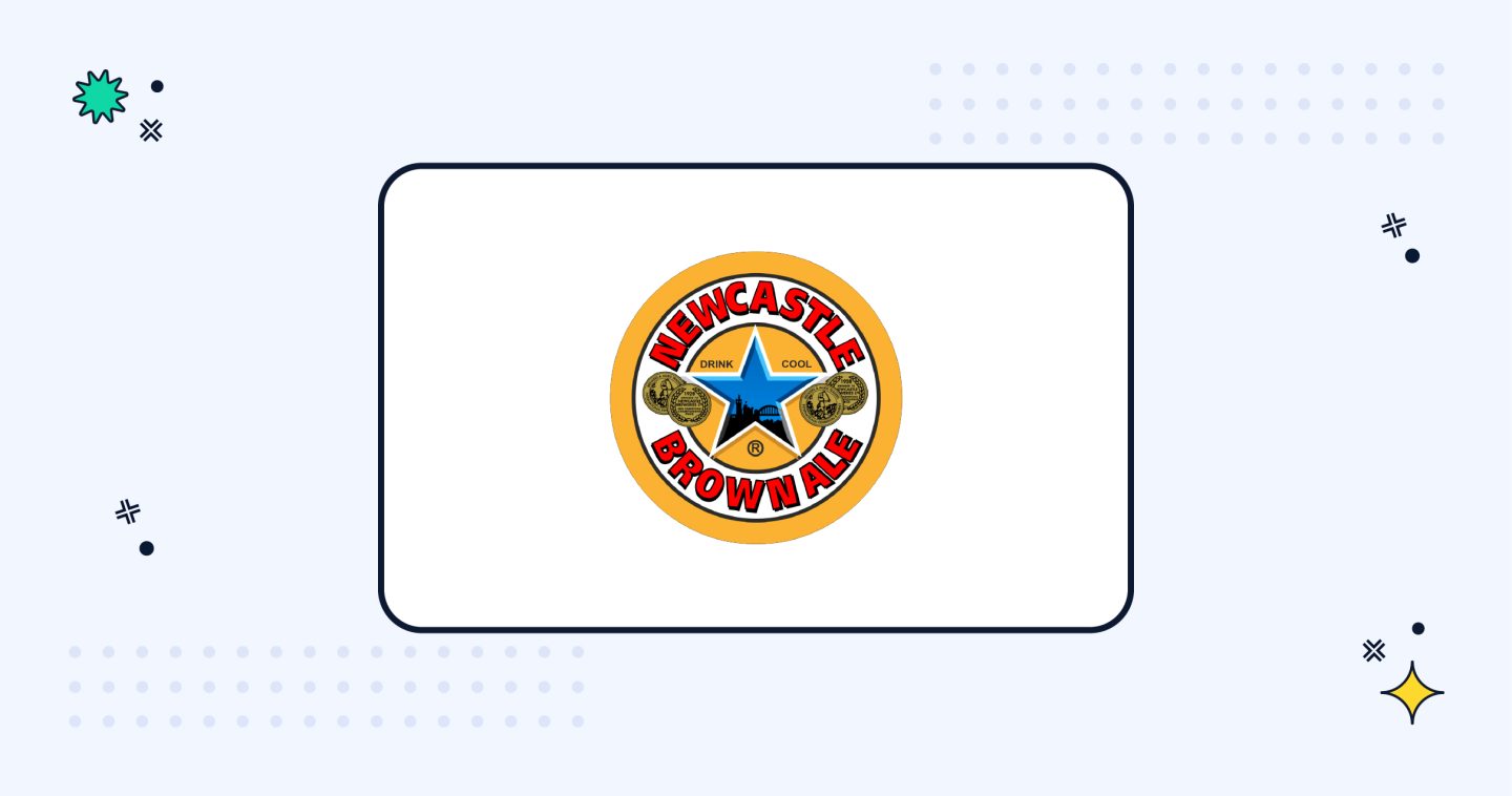
The Star That Outshone the Logo
For a time, Newcastle Brown Ale’s blue star was arguably more recognisable than the club’s own crest.
The beer, synonymous with the city (originally brewed on our doorstep, now sadly brewed in Tadcaster, Yorkshire) and worn proudly on the black and white stripes, became an accidental but powerful brand icon.
Some might argue that Brown Ale’s star -simple, bold, and unmistakably linked to Newcastle- represents the kind of minimalist design that football branding now favours.
The blue star became such a recognisable element of the club that it could’ve easily been mistaken for an integral part of the logo.
Andy Cole’s Asics kit springs to mind, which had the blue star front and centre. In 1995, the full Brown Ale logo was brought onto the shirt, and it was only then that it became apparent to many that the blue star was, in fact, a sponsor, and not an additional part of the logo.
This highlights the power of the icon and suggests that it could 100% be a secondary logo for Newcastle. Even just seeing the bottles with the logo on reminds you of Newcastle, no matter where you are in the world.
Design Insight: As Newcastle are planning to modernise the logo, could the blue star serve as inspiration? The blue star icon has the Newcastle skyline in and this could easily be updated to represent the new influx of modern buildings.
Fans would recognise the landmarks and it would be an effective shift towards a modern era, showing the modern skyline of the city itself. This would be a great example of how an icon can change with the times.

The Toon Army Takeover: An Opportunity for Change?
With new ownership comes new ambition, and Newcastle’s Saudi-backed resurgence has already seen a transformation in recruitment, infrastructure, and competitiveness. Not to mention, the recent win of the Carabao Cup.
The club is about to refresh their identity to reflect the new era.
They have already taken steps in a digital direction with the mono crest that honours the iconic black and white. The mono crest is sleek and very versatile, and will work well across a range of platforms.
Some football clubs have rebranded to signify change (Juventus’ drastic, almost fashion-esque, minimalist badge update in 2017 springs to mind), but rebranding does not always go to plan. This is why a lot of fans are currently torn.

Take Leeds United’s failed 2018 rebranding attempt.
The club attempted to introduce a new badge featuring a stylised ‘Leeds Salute’, claiming it reflected fan culture and club unity.
The response?
Pure outrage. Within hours, more than 77,000 fans signed a petition to scrap the new design, forcing the club to backtrack.
That rebranding failure showed how detached branding decisions can alienate fans if they do not respect history and tradition. This is exactly why many Newcastle supporters might feel uneasy about modernising the Newcastle United logo.
When the rebrand happens, it needs to strike a careful balance—modern, but still unmistakably Newcastle. (And ideally, handled by a Newcastle branding agency!)
There will undoubtedly be a ton of fans with interesting ideas on ways their favourite club can refresh their logo. Participation can be a fun way of involving fans in the process, and it’s also a great way to find unique ideas that might not have had a platform otherwise.
But can too many cooks spoil the broth? Maybe.
But involving more people can also shed light on great ideas.
For an updated logo to be effective and make a lasting impression, it needs to have meaning behind it. We’re looking for more than just a “this should go there” kind of feeling. When Newcastle revamp their logo, having the right people in the room is absolutely vital.
Now is a good time for a change, but it needs to be well thought out to the very last detail.
For the new emblem, the club could:
- Modernise the existing crest while keeping heritage elements.
- Take inspiration from Arabian horses. They’re powerful, mythical creatures that align with both the seahorse and the club’s new backing.
- Do nothing and stick to tradition and embrace the “if it ain’t broke” mentality.
The Leeds rebranding disaster is a warning:
Change for the sake of change can backfire spectacularly. If Newcastle were to rebrand, how should they do it?

So, Here We Are
After years of speculation, it’s finally happening. It was announced in May 2025 that Newcastle United have officially started the process of redesigning the club crest.
The current badge, first introduced in 1988, is being re-evaluated for how it works in a digital-first world.
The club says the intricacy of the design, with its seahorses, castle, and ribbon details, doesn’t always show up well across their digital brand touchpoints, as well as their kits and merchandise.
And as the club grows globally, they want to make sure the symbol that represents us keeps up.
To be clear, this isn’t just a boardroom decision.
Fans have been invited to take part in the consultation, with season ticket holders and members being asked to share their views on whether the crest should be refined, revised or completely reimagined.
Keeping the current badge isn’t one of the options, but preserving the spirit of it clearly is.
And there’s been a mix of reactions, as you’d expect.
For many, the crest is more than a logo. It’s been there through thick and thin, from nights in Europe to afternoons in the Championship, stitched into shirts, printed on flags, and, yes, even tattooed on skin.
Changing it won’t be easy, but the club insists this is about evolution, not erasing history.
Brand workshops, surveys, and design discussions are ongoing, and a new crest won’t appear until the 2026–27 season at the earliest. Until then, there’s a chance for fans to shape what comes next, and make sure that whatever replaces the current badge still feels like home.

Newcastle United Logo FAQs
-
When will Newcastle United's new logo be introduced?
A new crest isn’t expected before the 2027–28 season. Newcastle United has been consulting supporters throughout the redesign process, giving fans the opportunity to share their views before any final design is revealed.
-
Will Newcastle United completely replace its current badge?
Not necessarily. While the club has confirmed a redesign is underway, many expect it to be an evolution rather than a complete departure. The challenge will be modernising the crest while retaining iconic elements such as the seahorses, castle and scroll that supporters associate with the club.
-
Why do football clubs redesign their logos?
Football clubs often update their badges to improve how they perform across digital media, merchandise and global marketing. A successful redesign can modernise a club’s identity without losing the history and symbolism that fans value.
-
What makes a successful football club rebrand?
The best football rebrands balance heritage with practicality. Rather than changing for the sake of it, successful redesigns retain recognisable elements, improve usability across modern platforms, and involve supporters throughout the process to maintain a strong connection with the club’s identity.
It Time For a Change? The Future of the Newcastle United Logo Design
Newcastle United’s badge has stood the test of time, surviving three decades of change in football while remaining a symbol of tradition, heritage, and identity.
But as football branding evolves, is it a good idea for our logo to change?
Rebrands can be powerful, but only when done right. (Maybe they should hire a Newcastle based branding agency! Cough cough, wink wink.)
A refresh could modernise the crest while maintaining its iconic elements, making sure it remains recognisable and timeless.
But as we have seen with the Leeds United disaster, change for the sake of change can backfire. Heritage matters.
So, does Newcastle United need an updated logo to reflect this new era?
Or:
Are you reluctant to embrace the change?
Let us know your opinion of the new emblem. Are we happy about modernising it? Or is our history too important to touch?