Indeed: A Brand Breakdown

Overview

Back in 2004, Paul Forster and Rony Kahan launched Indeed, and job hunting’s never been the same. Fast forward to today, it’s the world’s top job site, helping millions of people across 60+ countries (and 28 languages) land their next job.

Chances are, if you’ve been looking for a job (or a new employee), you’ve been on Indeed…

As part of our brand breakdown series, we’re diving into what makes Indeed’s brand identity a success. From its iconic logo to its inclusive tone of voice, we explore how the brand built its rep as the go-to in recruitment.

The mission? Simple: help all people get jobs. And that people-first mindset shapes everything: design, language, user experience, the lot.

It’s not just job listings. Indeed offers resume tools, salary insights, company reviews – everything you need to land (or fill) the role.

Indeed is aiming to streamline the hiring process and make it more efficient and effective for both job seekers and employers.

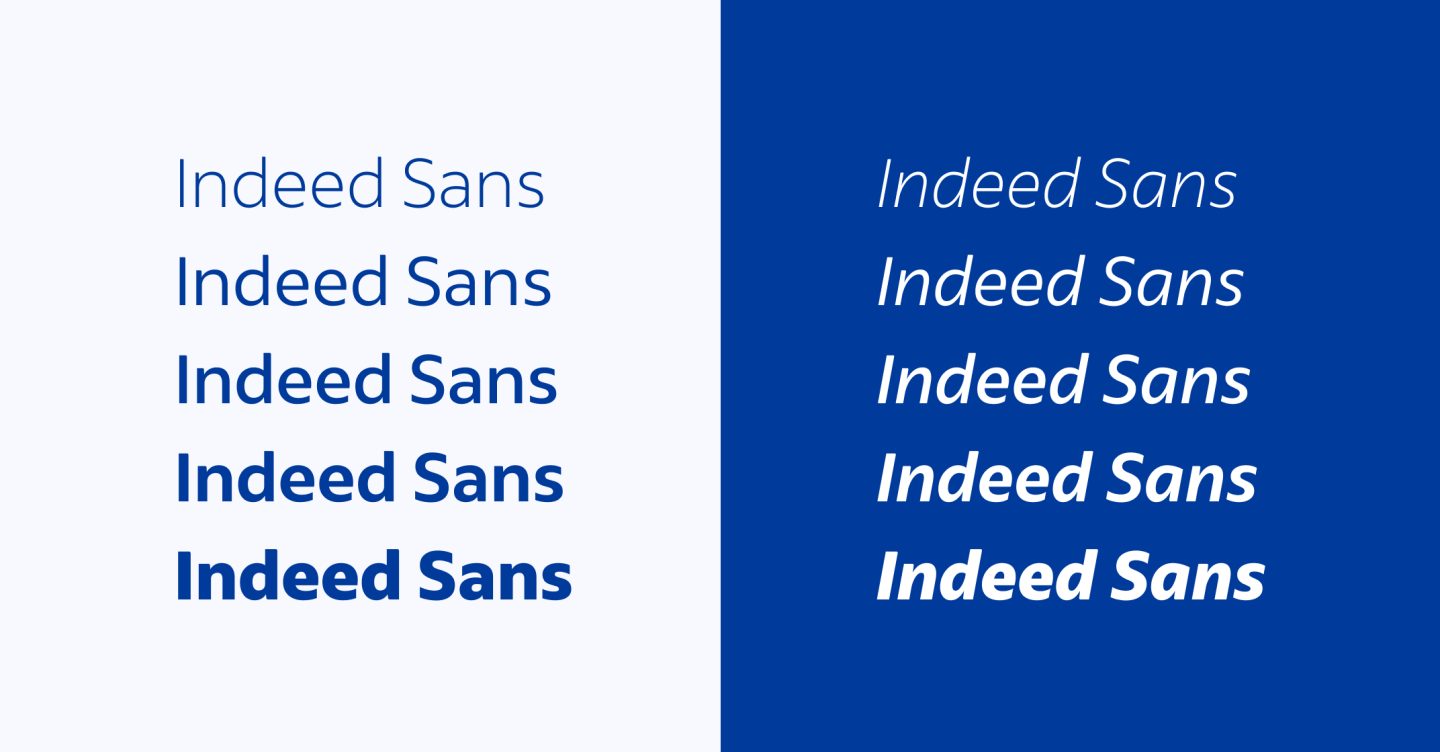
In 2021, Indeed underwent its most significant brand transformation in history, introducing a new visual identity that aligns with its evolving mission and values. This rebranding reflects Indeed’s dedication to creating a modern experience that resonates with users worldwide.

With a user-centric approach and a global reach, Indeed continues to be a central player in the recruitment industry, helping to create connections that drive career growth and business success.

Let’s break down some of the elements of their brand identity.

Logo History

Indeed Logo

Other than a refresh as part of the 2021 updates to the brand identity, the Indeed logo has remained largely unchanged since the brand’s inception – and that’s kind of the point. Its simplicity has contributed to its recognition as a leading job site.

The Indeed logo is a lowercase sans serif wordmark featuring a distinctive arc over the “i” that resembles a human figure, symbolising the company’s focus on people and their career journeys.

The rounded letters convey a feeling of friendliness and openness, aligning with the brand’s values of accessibility and inclusivity.

Bright blue Indeed logo on a white background

Logo 2004 – 2021

The logo that was in use from the company’s founding in 2004 until 2021 was a light, bright, and very dot-com-era blue. It did the job, but in hindsight? Maybe a little too chipper.

Dark blue indeed logo on a white background

Logo 2021 – Present

Thankfully, they dialled it down. The wordmark remains the same, but utilises a slightly darker, more serious shade of Indeed Blue (#003A9B).

Logo Symbol

The standalone “i” shows up in places where the full logo would be overkill – think app icons or favicons. That arc over the “i”? It’s not just decorative, it suggests movement and people, a subtle nod to Indeed’s mission. The design evokes a feeling of approachability and optimism, reinforcing the brand’s focus on people and their career journeys.

Usage Guidelines

Indeed states that the logo should be used in its approved forms without alterations. Clear space around the logo should equal the height of the “e” in “Indeed” to maintain visual integrity.

The standalone “i” symbol is used by Indeed in specific contexts where the brand is already clearly identified, such as on mobile app icons and social media avatars. This helps to make sure that the symbol maintains its association with the Indeed brand and avoids confusion.

Both the symbol and the wordmark are presented in Indeed Blue (#003A9B) or white, depending on the background, to maintain visual consistency and brand recognition.

Typography

Indeed Sans on white and blue backgrounds

Indeed Font & Typography

Indeed’s typefaces strike a nice balance between approachable and professional.

Their typography strategy is designed to convey warmth, clarity, and accessibility across all platforms.

Here’s an in-depth look at the typefaces that make up Indeed’s visual language:

Primary Typeface: Indeed Sans

Indeed Sans is a custom-designed, humanist sans-serif font developed in collaboration with Dalton Maag. It features five weights, optimised for legibility and offering a wide variety of expressions.

The typeface’s design includes generous proportions and shapes reminiscent of handwriting, contributing to a warm, clear, and positive tone. Indeed Sans shows up across various assets, including product marketing websites, events, advertising, and social media.

Secondary Typeface: Noto Sans

Noto Sans is an open-source font family – it’s not flashy, but it’s functional. It keeps consistency and readability across multiple languages thanks to compatible heights and stroke thicknesses.

This maintains a consistent presentation across Indeed’s global platforms. Noto Sans is employed throughout Indeed’s products and for global language support.

Usage Guidelines

Indeed keep their font sizes above 10pt and avoid using lightweight or thin font weights, especially in print materials, to enhance readability and accessibility.

Colour Palette

Indeed brand colours, Indeed blue, ink blue, and white

Indeed Colour Palette & Hex Codes

Indeed’s brand palette is simple but effective. They have three core brand colours – two shades of blue, and white – that they use across their marketing materials, helping them to be “unmistakably Indeed”.

The brand also have a range of “expressive colours” which they use to create emphasis and variety, without overshadowing their primary colour palette.

Primary Brand Colours: Indeed Blue, Ink Blue and White

Indeed Blue is the cornerstone of the brand’s visual identity. It’s vibrant, modern, and instantly associated with the brand across job listings, advertising, and their platform interface.

  • HEX: #003A9B
  • RGB: 0, 58, 155
  • CMYK: 100, 80, 0, 0
  • Pantone: PMS 293 C

Ink Blue adds depth and contrast. It’s used to support layout elements and typography while maintaining a polished, professional tone.

  • HEX: #00123C
  • RGB: 0, 18, 60
  • CMYK: 100, 90, 30, 70
  • Pantone: PMS 2768 C

White provides breathing space and balance. It’s used generously to make content feel accessible and uncluttered.

  • HEX: #FFFFFF
  • RGB: 255, 255, 255
  • CMYK: 0, 0, 0, 0

According to Indeed’s brand guidelines, these core colours should always lead the visual hierarchy. They create consistency across touchpoints and help keep the brand unmistakably Indeed.

Indeed Expressive colour palette

Supporting Brand Colours: Expressive Colours

To inject variety and highlight key messages, Indeed’s visual system includes a palette of expressive colours.

These shades – ranging from Green, Aqua, and Purple, to Magenta, Orange, and Earth tones – are used sparingly and strategically.

They’re designed to add emphasis and visual interest while keeping the focus firmly on the core blue palette.

The expressive colours are especially useful in campaigns, infographics, and UI elements where extra differentiation is needed, but they’re never meant to overpower the primary brand colours.

Tone of Voice

Indeed Tone of Voice

Indeed’s tone of voice is human, helpful, and inclusive. Think of it as the supportive friend you want in your corner during a job search.

It’s conversational, aiming to be approachable and natural, without being too casual. It speaks in a way that feels familiar and supportive, sounding helpful rather than too corporate.

Inclusivity is at the core.

That means using respectful, up-to-date language that welcomes everyone, avoiding jargon, and putting people first in every interaction.

Accessibility also plays a key role, with content crafted to be easy to read, hear, or navigate for all users.

The tone is adaptable.

Depending on the context, it adjusts, reassuring when people feel uncertain, inspiring when they need motivation. Whether the message is serious or light-hearted, it always comes from a place of empathy.

Indeed is also confident.

The brand doesn’t shy away from being bold or taking a stand, but it does so thoughtfully. Altogether, the voice reflects an understanding of the job search journey and is designed to support people through it.

Imagery

An example of Indeed's illustration style, featuring four people doing different jobs

Indeed Imagery & Illustration

Indeed’s imagery and illustrations are all about real people, real emotions, and real connection.

The brand uses a combination of photography and illustration to reflect the diverse, inclusive world of work. They always place people at the centre.

Indeed’s imagery focuses on authenticity.

Photos are candid and relatable, aiming to capture real emotions, moments, and settings that job seekers and employers can see themselves in.

There’s a deliberate move away from overly polished or posed shots, with photos that feel lived-in and genuine. Inclusive representation is key, with attention paid to diversity in age, race, ability, gender, and more.

Indeed’s illustrations are friendly, bold, and full of character. Indeed’s style uses clean lines, geometric shapes, and bright pops of their brand colours. Figures are often simplified but expressive, designed to support messaging without distracting from it.

The goal is to add energy, emotion, and clarity.

Together, imagery and illustration work to make Indeed’s brand feel approachable, human, and empowering. This reinforces their mission to help all people get jobs.

Website

Indeed Website

Clean. Intuitive. Easy to navigate.

Indeed’s website is designed with both job seekers and employers in mind, prioritising clarity and accessibility.

The interface is clean and intuitive, with plenty of white space, consistent use of the brand’s blue palette, and typography that supports readability. Calls to action are straightforward and visible, guiding users through job searches, applications, and employer services.

Content is structured to make everything straightforward. Search functions are prominent, filtering is simple, and helpful resources are clearly labelled.

The design reinforces trust. Visuals, messaging, and layout come together to make users feel supported, informed, and empowered, whether they’re posting a job or applying for one.

Reference Panel

Quick Reference Panel

Here’s a quick reference guide for Indeed’s visual and written communications:

Indeed Logo:

  • Wordmark: Use the primary wordmark in Indeed Blue or white; avoid alterations.
  • Symbol: Use the standalone “i” symbol in specific contexts where the brand is already clearly identified, such as on mobile app icons and social media avatars.

Colours:

  • Prioritise Indeed Blue and white; incorporate expressive colours as accents.
  • Indeed Blue: #003A9B
  • Ink Blue: Hex #00123C
  • White: #FFFFFF

Typography:

  • Primary Typeface: Indeed Sans should be used for expressive content.
  • Secondary Typeface: Noto Sans should be used for functional content.

Tone of Voice:

  • Maintain a warm, clear, and positive tone in all communications.

Imagery:

  • Use a combination of photography and illustration to reflect the diverse world of work.
  • Candid and relatable images that always put people at the centre.

Brand Guidelines

Indeed Brand Guidelines

Indeed’s brand guidelines are thorough without being stuffy.

They offer a detailed framework for maintaining visual and verbal consistency across all communications. These guidelines are designed to help internal teams and partners use the brand correctly and confidently.

They cover everything from logo usage and clear space rules to the brand’s custom typefaces and colour palettes. Each element is explained with examples, showing how to create assets that reflect Indeed’s approachable, inclusive, and modern identity.

Beyond visuals, the guidelines also outline tone of voice and accessibility standards. This helps keep Indeed’s messaging clear, respectful, and people-first across all platforms.

For the full brand system, including downloadable assets and practical tips, visit indeed.design.

Using This Information

How to Use This Information

Whether you’re a designer, marketer, or recruiter, there’s a lot to take away from Indeed’s branding.

Use this breakdown as a source of inspiration and a practical guide to what makes a recruitment brand feel trustworthy, human, and consistent.

From a carefully considered tone of voice to thoughtful use of colour and typography, Indeed demonstrates how every brand touchpoint can reinforce a clear identity.

If you’re in the recruitment space, it’s especially relevant.

A strong recruitment brand isn’t just about standing out, it’s about building trust and connecting with the right people at the right time.

Indeed nails this by putting people first in everything they do.

Strong recruitment branding can attract top talent, streamline the hiring journey, and make your business the one candidates want to work for.

Work With Us

At Canny, we help recruitment companies – and brands of all kinds – craft identities that connect with the people that matter, whether that’s candidates, clients, or internal teams.

From strategy and tone of voice to visuals, websites, and content, we’ll help you build a compelling brand that resonates with your audience.

Ready to create a recruitment brand that makes the right impression?

Let’s talk.

Monster fur background

Ready to tame your marketing monster?

Good, so are we!

Let's chat, we don't bite