Amazon Overview
Amazon was founded on 5 July 1994 by Jeff Bezos, who incorporated the company as Cadabra, Inc. and ran it from a rented garage in Bellevue, Washington, after quitting a Wall Street hedge fund job to build what he pitched to early investors as the world’s largest bookstore. Bezos and his wife dropped the Cadabra name after his lawyer misheard it as “cadaver” over the phone; the alternative he seriously considered, Relentless, was registered as Relentless.com and still redirects to Amazon’s website today. The site launched publicly on 16 July 1995, selling its first book, Douglas Hofstadter’s “Fluid Concepts and Creative Analogies”, and did roughly $20,000 of business a week within two months.
Learn More Show Less
Amazon went public on 15 May 1997 at $18 a share, raising about $54 million and valuing the three-year-old company at roughly $438 million. Growth followed fast: international sites in the UK and Germany arrived in 1998, third-party Marketplace selling launched in 2000, Amazon Prime debuted in 2005 at $79 a year, and Amazon Web Services launched in March 2006, eventually becoming the company’s most profitable division. The Kindle arrived in 2007, and the $13.7 billion acquisition of Whole Foods Market in 2017 pushed Amazon into physical grocery retail. By fiscal year 2025, Amazon reported $716.9 billion in net sales and $77.7 billion in net income, with roughly 1.56 million employees worldwide following a round of corporate layoffs in early 2026.
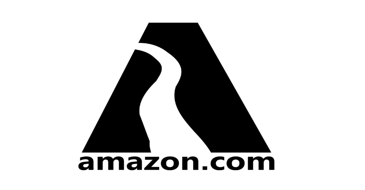
Amazon’s visual identity took several attempts to settle. The first logo (1995-1997), designed by Turner Duckworth, set a black letter “A” against a winding white river motif nodding to the Amazon River and Bezos’s ambition for scale. A 1997 revision kept the river shape but filled it with a busy zebra-stripe texture that proved too complex to read clearly, and 1998 brought a scramble of experiments, including a plain “amazon.com” wordmark under the tagline “Earth’s Biggest Bookstore”, as the company expanded beyond books.
Turner Duckworth returned in 2000 to design the mark still in use today: a lowercase “amazon” wordmark with “.com” dropped, and an orange arrow curving from the “a” to the “z” that signals both the company’s everything-from-A-to-Z selection and, read differently, a smile. The logotype is not a licensed typeface but bespoke lettering historically linked to ITC Officina Sans Bold, refined into a custom mark Amazon no longer treats as tied to any commercial font. The standalone app icon, a simplified version of the arrow motif, was quietly adjusted in 2021 after some users noted it resembled a toothbrush moustache above a strip of blue tape.
Amazon’s brand guidelines, most visibly documented in a 2012 display-advertising style guide it still publishes, fix the corporate colours as Amazon Orange (#FF9900) and Black, permit only specific two-colour and reversed lockups, and explicitly forbid tints, screens or unapproved recolouring of the logo. For everyday typography, Amazon commissioned foundry Dalton Maag to design Amazon Ember, a humanist sans-serif released from 2015 and first deployed on the Kindle Oasis in 2016, engineered to stay legible across thousands of device types and many languages. Dalton Maag separately built Bookerly, a serif face reserved for long-form reading on Kindle devices, treating the reading experience as typographically distinct from shopping and product interfaces.
Amazon’s everyday tone of voice, as its own guidance and independent breakdowns describe it, is clear, concise, matter-of-fact and respectful: it explains complex ideas simply, avoids jargon and exaggeration, and aims to guide customers to a decision rather than persuade them with hype. That restraint sits in sharp contrast with Amazon’s biggest marketing moments. Its Super Bowl campaigns, created largely with London agency Lucky Generals and production company Hungry Man, have leaned on broad celebrity comedy: 2018’s “Alexa Loses Her Voice” replaced Alexa’s voice with Gordon Ramsay, Cardi B, Rebel Wilson and Anthony Hopkins and topped that year’s USA Today Ad Meter, while 2021’s “Alexa’s Body”, starring Michael B. Jordan, became the most-watched Super Bowl ad on YouTube that year and earned Amazon and Lucky Generals an Emmy nomination, their second. More recently, Amazon’s in-house creative team has produced emotionally led Christmas advertising: 2023’s “Joy Ride”, following three lifelong friends reliving a childhood sledging trip, became the company’s most successful Christmas campaign to date and was re-released in 2025 rather than replaced.
Amazon’s website mirrors the restrained product voice: a search-first homepage, dense product-listing pages built for speed rather than storytelling, left-aligned text for natural reading flow, and Amazon Orange reserved almost exclusively for calls to action against a black-and-white base. Competitively, Amazon operates across e-commerce, cloud infrastructure, devices, advertising and streaming simultaneously, a breadth that puts it in different competitive sets depending on the business line, from Walmart and Target in retail to Microsoft Azure and Google Cloud in infrastructure.
The clearest lesson in Amazon’s brand history is that scale rewards discipline over novelty. The company tried four visibly different logo directions in its first five years before Turner Duckworth’s 2000 arrow-and-smile solved the problem for good; since then, Amazon has protected that single visual device through more than two decades of expansion into books, general retail, devices, cloud computing and media, layering strict, explicit usage rules on top of it rather than letting a diversifying business pull the identity in different directions.