Tim Hortons Branding and Brand Guidelines

Canada's everyday coffee-and-donut chain since 1964

Founded in 1964 in Hamilton, Ontario, Canada Website

Tim Hortons Overview

Tim Hortons opened its first store on 17 May 1964 in Hamilton, Ontario, founded by Toronto Maple Leafs defenceman Tim Horton alongside partner Jim Charade, trading initially as Tim Horton Donuts. Horton could give the business only a day a week around his hockey schedule, so operational control passed in 1965 to Ron Joyce, a former Hamilton police constable who bought into the fledgling shop. By 1967 Joyce and Horton were full partners running three stores. Horton died in a car crash in February 1974; Joyce bought out the Horton family’s stake for roughly one million dollars and took sole control of what was then a 40-store chain, then spent the next three decades building it into a national institution.

Learn More Show Less

Growth accelerated through the late 1970s and 1980s as the chain expanded coffee-and-donut format stores across Ontario and then the rest of Canada. Tim Hortons merged with Wendy’s International in 1995, a relationship that lasted until Wendy’s spun the chain off again in 2006. In 2014 Tim Hortons was acquired by 3G Capital and merged with Burger King to form Restaurant Brands International (RBI), which remains the parent company today, headquartered in Toronto. By the end of 2025 RBI reported system-wide sales of roughly USD 7.573 billion for the Tim Hortons segment across Canada and the US, with 3,903 restaurants in Canada and 683 in the United States, alongside a growing international footprint stretching to the UK, Gulf states, the Philippines and China.

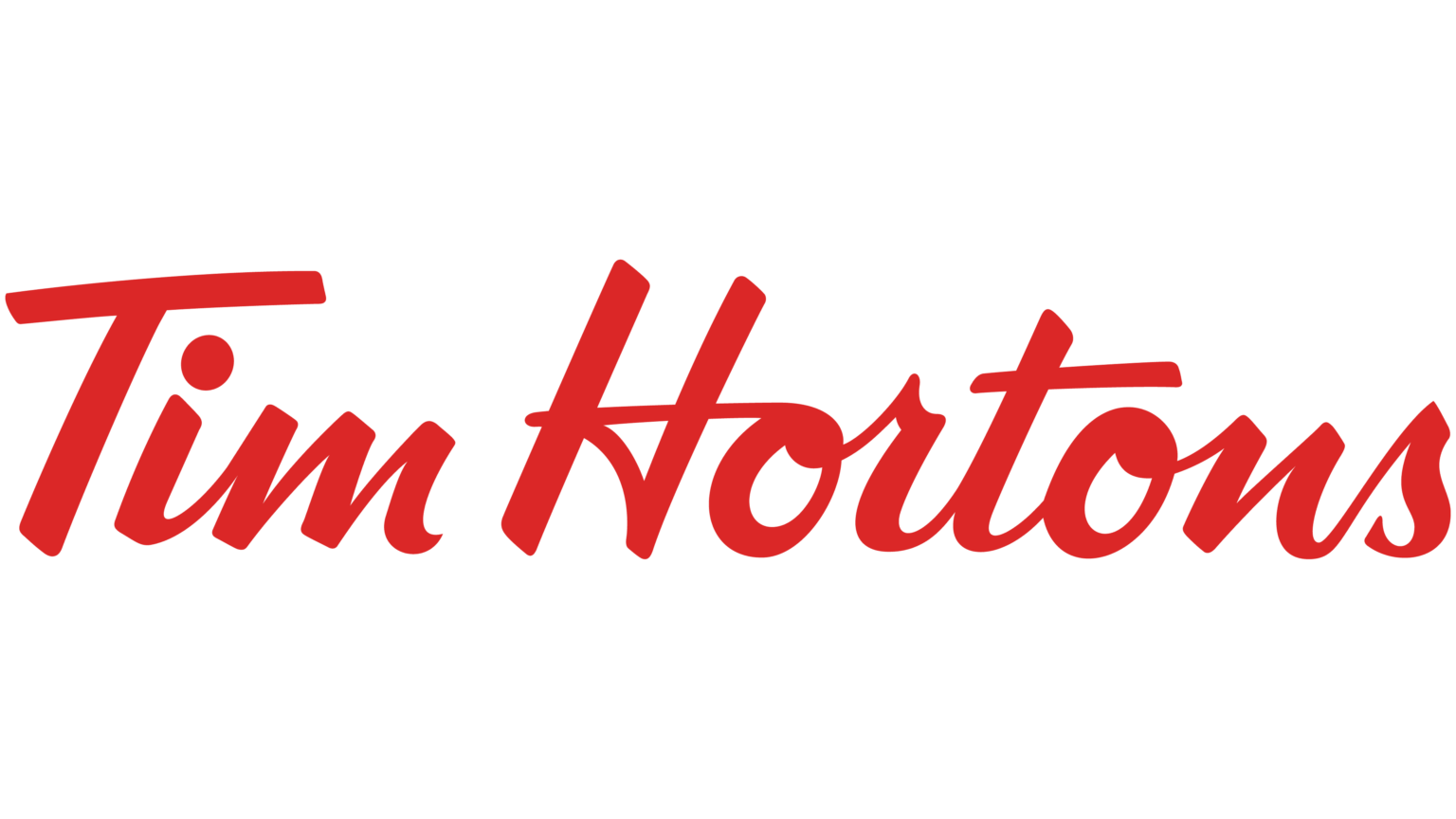
The visual identity has been simplified across five broad eras since 1964. The earliest mark used two stacked ovals, a red band reading “Tim Horton” above a yellow band reading “Donuts”, with an illustration of chocolate donuts beneath. A 1990s update dropped the donut illustration and the word “Donuts” entirely as the menu diversified beyond baked goods, foregrounding the red oval wordmark that most Canadians associate with the brand. Further refinements followed in 2015, and in 2017 Tim Hortons underwent its most significant modern redesign, led by London design agency Turner Duckworth with the wordmark itself designed by Geoff Halpin, tightening the lettering and cleaning up the oval into the flatter, more geometric mark used today.

The current identity centres on Tim Hortons red (commonly cited as #C8102F, though some brand-colour databases list close variants such as #DC0F2D) set against white, with the red oval acting as the fixed anchor of every application from cup sleeves to storefront signage. The wordmark is a bespoke bold sans-serif logotype rather than a licensed typeface, reinforcing a blunt, functional character consistent with a value-driven quick-service brand rather than a premium coffeehouse.

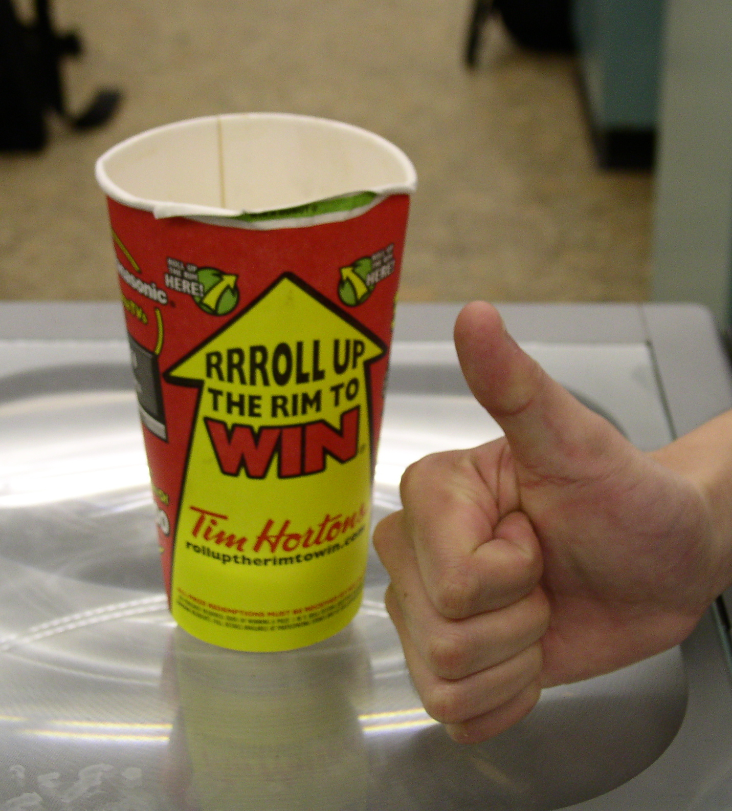
Advertising has leaned heavily on Canadiana and everyday ritual rather than product superiority claims. The longest-running and most commercially significant campaign is Roll Up the Rim to Win, launched in 1985 (some company materials cite 1986) as an in-cup instant-win promotion tied to coffee purchases. It ran largely unchanged as a physical paper-cup mechanic for 25 years before Tim Hortons shifted it into its loyalty app in 2020 during the pandemic, and by its 2026 edition the promotion offered more than 30 million prizes, including roughly 17 million free coffees. Toronto agency Zulu Alpha Kilo, which has led Canadian creative for Tim Hortons since around 2018, reframed the 2019 edition as a mock professional sport, complete with “Roll Up Legends” mockumentary-style films.

The brand’s other long-standing platform is True Stories, built on user-submitted stories collected via the EveryCup.ca site launched in 2008, which Tim Hortons has mined for emotionally-driven “based on a true story” spots ever since. The platform was relaunched globally in 2018 by Gut, the Miami-based agency founded by Anselmo Ramos and Gastón Bigio, working alongside Zulu Alpha Kilo, drawing on roughly 18,000 organically submitted stories to produce six new films centred on real Canadians. This followed the end of a advertising relationship with J. Walter Thompson Canada that had run since the 1990s. Across eras the throughline has been hockey, small-town Canada and blue-collar routine rather than coffee craft or barista culture.

Tone of voice is plain, warm and unpretentious, favouring everyday language over coffeehouse jargon, and consistently framing the brand as part of Canadians’ daily routine rather than an aspirational treat. Tim Hortons has no persistent brand mascot; its equity is carried instead by the red oval, the paper cup and recurring cultural touchpoints like hockey sponsorship and Roll Up the Rim, rather than a character.

Competitively, Tim Hortons sits between McDonald’s McCafé and Starbucks in Canada, undercutting Starbucks on price and formality while offering a broader food menu than most coffee-led competitors. Its position is built less on product differentiation than on sheer density of stores and decades of embeddedness in Canadian daily life, a position increasingly tested as it pushes into rural and Western Canadian markets and expands internationally under RBI ownership.

The lesson in the Tim Hortons record is that a value-priced, functional brand can sustain outsized cultural weight through consistent, low-concept rituals repeated for decades, Roll Up the Rim chief among them, rather than through periodic reinvention. Its visual and verbal identity has narrowed and simplified over sixty years, but the underlying promise of an accessible, everyday cup of coffee has stayed constant since Ron Joyce took over the original Hamilton shop.


What Tim Hortons Does Well

  • Decades-long promotional consistency through Roll Up the Rim, running since 1985 and still central to the brand's identity forty years later.
  • Extremely dense store network in Canada, with 3,903 locations at the end of 2025, embedding the brand in daily national routine.
  • Strong narrative equity built on real customer stories collected since 2008 via EveryCup.ca, giving True Stories campaigns an authentic, low-cost content pipeline.

What We Can Learn from Tim Hortons

  • A single long-running promotional mechanic, repeated with minor variation over decades, can build more brand salience than frequent campaign reinvention.
  • Cultural specificity, in this case hockey and small-town Canadiana, can be a durable differentiator against larger global competitors offering similar products.
  • Simplifying a visual identity gradually over sixty years, rather than through abrupt overhauls, can preserve recognition while modernising execution.

Background

Founding year (1964) and location (Hamilton, Ontario) confirmed across multiple sources; founders' names given variously as Jim Charade and Ron Joyce depending on source. Red hex varies slightly (#C8102F vs #DC0F2D) across brand-colour databases; Brandfetch access was not directly available during research.

Colour Palette

Notable Rebrands

Current

2017 Turner Duckworth Redesign

2017

Turner Duckworth, working with designer Geoff Halpin, simplified and geometrised the red oval wordmark, the most substantial identity update since the 1990s removal of the donut illustration.

Colour Palette

Tim Hortons Red

Primary

HEX: #C8102F

RGB: 200, 16, 47

CMYK: 15, 100, 90, 5

Core brand colour used for the oval wordmark, storefront signage and cup branding; also cited as #DC0F2D in some databases.

White

Secondary

HEX: #FFFFFF

RGB: 255, 255, 255

CMYK: 0, 0, 0, 0

Background and reverse-type colour, providing contrast against the red oval on packaging and signage.

Dark Red

Dark

HEX: #8A0B21

RGB: 138, 11, 33

CMYK: 18, 100, 78, 30

Shadow/depth variant used in shading and gradient applications of the primary red.

Warm Brown

Accent

HEX: #4A2E1E

RGB: 74, 46, 30

CMYK: 0, 38, 59, 71

Coffee-toned accent used across packaging and in-store decor to evoke roasted coffee.

Tone Profile

Funny
Serious
Formal
Casual
Respectful
Irreverent
Enthusiastic
Matter-of-fact

Tone Shape

Tone Pillars

Everyday

Positions itself as part of ordinary daily routine rather than an aspirational treat or luxury purchase.

Canadiana

Leans on hockey, small towns and shared national ritual as recurring reference points across advertising.

Unpretentious

Plain, direct language avoiding coffeehouse jargon or premium-craft claims.

Community

Advertising built on real customer stories and grassroots sponsorship rather than celebrity endorsement.

Context Responses

Seasonal in-store promotion (Roll Up the Rim) Playful but low-key, framing a coffee purchase as a small daily chance to win rather than a hard-sell contest.
Brand storytelling campaign (True Stories) Warm and sincere, using real customer-submitted stories with minimal embellishment.
Menu and pricing communication Plain, value-led language emphasising everyday affordability over product craft.

The tension sits between mass-market, value-priced convenience and the emotional weight the brand claims through hockey and small-town Canadiana.

Tim Hortons Custom Wordmark

Primary · Custom

Bespoke bold sans-serif logotype used in the red oval mark since 2017

Helvetica Neue Bold

Secondary · System

Menu boards, packaging copy and digital app typography

Typography Background

The Tim Hortons wordmark has been redrawn several times since 1964, moving from a looser script-influenced lettering style toward a tighter, more geometric bold sans by 2017, when London agency Turner Duckworth and designer Geoff Halpin refined the current logotype. Supporting typography on menus, packaging and digital products uses plain grotesque sans faces chosen for legibility over character, consistent with the brand’s functional, everyday positioning.

Tim Hortons Campaigns

Roll Up the Rim to Win

1985

Long-running in-cup instant-win promotion, originally a physical roll-up paper cup mechanic; moved into the Tims Rewards app in 2020. The 2026 edition offered more than 30 million prizes including roughly 17 million free coffees.

Learn More →

Roll Up Legends (Roll Up the Rim as pro sport)

2019–2019

Zulu Alpha Kilo-led mockumentary-style campaign for the 33rd season of Roll Up the Rim, treating the contest as a professional sport with fictional 'Roll Up Legends'.

Learn More →

True Stories

2008

Ongoing storytelling platform built on user-submitted stories collected via EveryCup.ca since 2008; relaunched globally in 2018 by agency Gut with Zulu Alpha Kilo, drawing on roughly 18,000 submitted stories for six films centred on real Canadians.

Learn More →

Website Signals

  • Clear pricing and menu information on homepage
  • Loyalty app (Tims Rewards) prominently promoted
  • Roll Up the Rim promotion given dedicated campaign page
  • Brand history/heritage section on corporate site
  • Barista or coffee-craft educational content
  • Sustainability/sourcing detail comparable to premium coffee chains

Strengths

Loyalty integration

The Tims Rewards app is deeply woven into ordering and promotions such as Roll Up the Rim, driving repeat visits through digital points and instant-win mechanics.

Menu simplicity

Clear, uncluttered presentation of a value-priced menu reinforces the brand's everyday, low-friction positioning against more elaborate coffeehouse competitors.

Roll Up the Rim's digital pivot

In 2020 Tim Hortons moved its 35-year-old physical roll-up-the-cup mechanic into its Tims Rewards app in response to pandemic hygiene concerns, permanently changing how the promotion is played.

View resource
Tim Horton's own hockey career

Founder Tim Horton was an active NHL defenceman for the Toronto Maple Leafs while running the business, winning four Stanley Cups; he died in a car crash in 1974, aged 44, still playing professionally.

View resource
60th anniversary mark (2024)

For its 60th anniversary in 2024, Tim Hortons ran a limited commemorative maple-leaf logo incorporating a stylised '60', deployed across packaging and marketing to mark six decades since the 1964 Hamilton opening.

View resource

Want the full picture?

We're building deep-dive sector reports. Be first to know when yours drops.